Styled Application
Table of Contents
In this series, I am going to guide you on how to create your very own blog! Yes, by the end of this tutorial, you will have a personal blog very much similar to this one up and running. If you so wish, you can use your new understanding to further customize it to make it more personal.
For your referrence, below is a list of the articles I have included in this series:
- Chapter 1: Hello, World!
- Chapter 2: Working with Templates
- Chapter 3: Flask Web Forms
- Chapter 4: Introduction to Database
- Chapter 5: Displaying User Comments
- Chapter 6: Styled Application
- Chapter 7: Working with Dates and Time
If you enjoy this article, please consider supporting my work and

The completed project used in this article can be referenced here.
In this chapter, I will show you how you can replace the basic HTML templates we have been using and implement new ones based on the Bootstrap framework. Until this point, you can agree with me that we have focused so much on functionality and done little to none to improve the design of our blog. This was purposeful, and by design, because I did not want to get distracted by design before I got the application's logic right.
Build fast and responsive designs with Bootstrap
Bootstrap is a front-end framework that uses high-level CSS classes with pre-made styles for common types of user interfaces. Without a framework, we will be hard-tasked to design our own templates with custom styles. For example:
<html>
    <head>
        <title>Personal Blog</title>
        <link type="text/css" rel="stylesheets" href="styles.css" >
    </head>
    <body>
        <div>
            <h1>Welcome to My Blog</h1>
        </div>
    </body>
</html>
Our styles:
h1{
    text-align: center;
    color: red;
}
Above, we have had to identify what element we want to style, then added whatever styles we desire. As simple as this is, when you build larger applications, this can get a lot more complicated.
Like I said earlier, Boostrap provides pre-made CSS classes with custom styles. See its implementation below:
<html>
    <head>
        <title>Personal Blog</title>
        <link type="text/css" rel="stylesheets" href="styles.css" >
    </head>
    <body>
        <div class="container">
            <div class="row">
                <div class=" col-md-12 text-center">
                    <h1>Welcome to My Blog</h1>
                </div>
            </div>
        </div>
    </body>
</html>
The text Welcome to My Blog will be centered without the need of us writing our own styles for it. Bootstrap, like most other frameworks, also provide JavaScript add-ons for things that cannot be done strictly with HTML and CSS.
Using Bootstrap has several advantages:
- Cross-browser similarities
- Handling of multiple device sizes
- Layouts that can be customized
- Beautifully completed forms, alerts, toasts etc
A direct way to work with Bootstrap is to include the file bootstrap.min.css in your base template. You can import it directly from a CDN or you can download it and add it to your project. See the documentation to learn more.
The flask-bootstrap makes it a lot easier for us to work with Bootstrap by providing a base template. Let us install this extension:
$ pip3 install flask-bootstrap
Register this extension in the application:
app/__init__.py: Boostrap instance
# ...
from flask_bootstrap import Bootstrap

app = Flask(__name__)

# ...
boostrap = Bootstrap(app)
The boostrap instance makes the boostrap/base.html available to us, and can be referrenced in our application templates using extends. You have seen me use extends when I wanted to import the base template into other templates. So, if I say we need to import bootstrap/base.html into our base file, is that even possible?
Yes! We will sort of have a three-level hierachy. This importation comes bundled with a few blocks such as title, navbar and content. I will greatly modify my base template to use this derived blocks.
app/templates/base.html
# Remove the back slashes

{% extends 'bootstrap/base.html' %}

{% block title %}
    {% if title %}
        <title>
            Gitau Harrison | \{\{ title \}\}
        </title>
    {% else %}
        <title>
            Welcome to My Personal Blog
        </title>
    {% endif %}
{% endblock %}

{% block navbar %}
<nav class="navbar navbar-default">
    <div class="container">
        <div class="navbar-header">
            <button type="button" class="navbar-toggle collapsed" data-toggle="collapse" data-target="#bs-example-navbar-collapse-1" aria-expanded="false">
                <span class="sr-only">Toggle navigation</span>
                <span class="icon-bar"></span>
                <span class="icon-bar"></span>
                <span class="icon-bar"></span>
            </button>
            <a class="navbar-brand" href=" \{\{ url_for('main.home') \}\} ">Gitau Harrison</a>
        </div>
        <div class="collapse navbar-collapse" id="bs-example-navbar-collapse-1">
            <ul class="nav navbar-nav navbar-right">
                <li><a href=" \{\{ url_for('about_me') \}\} ">About Me</a></li>
                <li><a href=" \{\{ url_for('portfolio') \}\} ">Portfolio</a></li>
                <li><a href=" \{\{ url_for('hire_me') \}\} ">Hire Me</a></li>
                <li><a href=" \{\{ url_for('my_interests') \}\} ">My Interests</a></li>
                <li><a href=" \{\{ url_for('flask_webforms') \}\} ">Flask Webforms</a></li>
            </ul>
        </div>
    </div>
</nav>
{% endblock %}

{% block content %}
    {% block app_content%}
        <div class="container">
            <!-- Our content will go here -->

        </div>
    {% endblock %}

    {% block footer %}
    <!-- Footer Goes Here -->
        <nav class="my-footer navbar navbar-default">
            <div class="container">
                <div class="col-xs-12 col-sm-12 col-md-12 col-lg-12 col-xl-12">
                    <ul class="nav navbar-nav">
                        <li><a href="#" target="_blank">Become A Patreon</a></li>
                    </ul>
                    <ul class="nav navbar-nav navbar-right">
                        <li><a href="#" target="_blank">YouTube</a></li>
                        <li><a href="#" target="_blank">GitHub</a></li>
                    </ul>
                </div>
            </div>
        </nav>
    {% endblock %}

    <!-- Our Scripts Go Here -->
    {% block scripts %}

    {% endblock %}
{% endblock %}

I literally used one of Boostrap's nav bars as my own. Everything should be self-explanatory. However, one thing I want to point out are these two blocks: content and app_content. The content block is a top-level Flask-Bootstrap container. It hosts the app_content block and the footer block. The app_content block is my own custom-made block where other templates will define their own content.
With these definitions, I have to rename all my other templates to use app_content.
app/templates/flask_webforms.html: Add app_content block
{% extends 'base.html' %}

{% block app_content %}
    <h1>Flask Webforms</h1>
    <!-- Previous code -->
{% endblock %}
You need to do the same for all the other templates.
Rendering Bootstrap Forms
Flask excells at rendering forms. If you recall, we had to create each field one by one and even added our own validation styles. Flask-Bootstrap comes with a macro that accepts Flask-WTF form object as an argument and renders it using Boostrap styles.
app/templates/flask_webforms.html: Render Booststrap forms
# Remove the back slashes

{% extends 'base.html' %}
{% import 'bootstrap/wtf.html' as wtf %}

{% block app_content %}
    <h1>Flask Webforms</h1>
    <!-- Previous code -->

    <div class="row">
        <div class="col-md-4">
            \{\{ wtf.quick_form(form) \}\}
        </div>
    </div>
{% endblock %}

Rendering Blog Comment
Our comments do not look very descent. I will prefer if they had a bit more space among them and also among each table data.
app/templates/_user_comments.html: Improved User Comments
# Remove back slashes

<table class="table table-hover">
    <tr valign="top">
        <td width="70px">
            <img src="\{\{ post.author.avatar(36) \}\}">
        </td>
        <td>\{\{ post.author.username \}\} says:<br>\{\{ post.body \}\}</td>
    </tr>
</table>

Rendering Flash Messages
We can also improve the way our flash messages look like. From bootstrap alerts, we can update our _user_comments.html sub-template to include one of the alert styles:
app/templates/_user_comments.html
# Remove back slashes

{% with messages = get_flashed_messages() %}
    {% if messages %}
        {% for message in messages %}
        <div class="alert alert-info" role="alert">
            \{\{ message \}\}
        </div>
        {% endfor %}
    {% endif %}
{% endwith %}

Rendering Proper Flask Footer
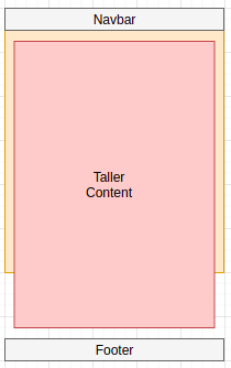
The facelift is quite impressive now. There is one more thing that we need to improve. That footer! I want the footer to be at the very bottom of our page. Currently, the footer comes right where our page content ends. What I want is when the page content does not fill the entire viewport (this is the screen size), then it should go to the very bottom of the view port. If the content is far taller than the viewport, then, the footer should be seen at the end of the taller content.
Footer beneath the content, even when the content is taller than the viewport.
Footer at the bottom of the page, leaving space between it and short content.

To achieve this, I will create my own styles in a styles.css file. Let us create this file inside the css folder:
$ touch app/static/css/styles.css
To ensure that the styles are applied, we need to link this file with our base template. I will use the styles block.
app/templates/base.html: Link styles file
# Remove back slashes

<!-- Previous code -->

{% block title %}
        <!-- ... -->
{% endblock %}

{% block styles %}
    \{\{ super() \}\}
        <link rel="stylesheet" type="text/css" href="\{\{ url_for('static', filename = 'css/styles.css') \}\}">
{% endblock %}

<!-- Previous code -->
We can now go ahead and create our own custom styles in styles.css:
/* ------------------------------------------------- */
/* BASE STYLES */
/* ------------------------------------------------- */
html, body{
    min-height: 100vh; /*Fills the viewport*/
    width: 100%;
    margin: 0px;
    position: relative; /*You have to include this in order to position other child items*/
    color: black;
}
body::after {
    content: '';
    display: block;
}
/* MEDIA QUIERIES */
@media all and (max-width: 992px) {
    body::after {
        height: 150px; /* Set same as footer's height when not using media queries*/
    }
    .my-footer{
        height: 50px;
    }
}
@media all and (min-width: 992px) {
    body::after {
        height: 50px; /* Set same as footer's height when not using media queries*/
    }
    .my-footer{
        height: 50px;
    }
}
.row{
    padding-bottom: 10px;
}
/* ------------------------------------------------- */
/* FOOTER */
/* ------------------------------------------------- */
.my-footer{
    margin-bottom: 0px;
    position: absolute; /*With the parent's position relative, we can set our footer to absolute*/
    bottom: 0; /*This takes it to the bottom*/
    width: 100%;
    /* height: 150px; */
}
The most important thing to note here is the position of the parent element and the footer. The parent element (in our case they are html and body) should be set to fill the entire viewport by specifying the minimum height as 100vh and their position to relative. The footer, on the otherhand, should be set to an absolute position. Ensure that you add margin: 30; to the footer to take it to the bottom.
To ensure that these styles are applied in all viewport sizes, I use media queries. For now, I am only interested in the footer and body styles. You can add more if you want.
Before I end this chapter, I will modify the structure of our application a bit. I will add a link in My Interests page which will redirect us to the URL associated with the flask_webforms view function. I will then remove this link in our base template. If I want to access Flask Web Forms page, I will do so through the My Interests Page.